How we focus on user needs at every phase of the design process
What do the most successful products have in common?
They are designed around the needs of the people that use them, delighting people with how easy and intuitive these products are. All too often companies will develop a product by building something that they believe people want or need. The problem is, many companies won’t take the time to test it, to see if they were right.
The most important part of turning any idea into a reality is focusing on “the how.” In the world of software: how will you create an application that meets the needs of all your clients? Here at Advisor360°, we do this by first understanding who our users are, why they need our software, and what their goals, challenges, and circumstances are.
Without the ability to empathize with users or understand how they work—and how your software helps them run their business—you are merely guessing.
At Advisor360°, crafting the best experience possible is part of our DNA. Our WealthTech company is comprised of thirteen designers and other team members that are certified in human factors and usability. They know that our applications are what firms rely upon to run their practices, because the easier and more efficiently they can do their work, the more successful they will be.
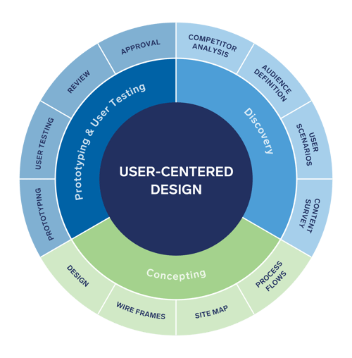
That’s why we take the time to understand and engage with our users at various points during our user-centered design (UCD) process. Our UCD process includes user research, task analysis, personas, information architecture, journey mapping, flow diagrams, wireframes, prototypes, and usability testing.
“User-centered design (UCD) is an iterative design process in which designers focus on the users and their needs in each phase of the design process. In UCD, design teams involve users throughout the design process via a variety of research and design techniques to create highly usable and accessible products for them” (Interaction Design Foundation).

Our UCD process will be used whether we are designing a feature within a page, an entire page, or a flow of pages. Some steps may be shortened depending on time frame, but it’s critical to always be testing with your users. According to Jakob Nielsen, the world's leading expert on web usability, “testing with just 5 users can find 85% of your product’s problems.”
There are 3 major phases that we go through in our design process:
Research
The Research phase is where we conduct user research to learn as much as we can about our users and the tasks they need to complete. We do competitive analyses to ensure that at the very minimum, we can match what other WealthTech software does. We strive to not just match but to lead the industry with our best-in-class user experience. Tracking user behavior and flows through the applications using analytics allows us to monitor and learn what features people are using the most/least, as well as the technology they are using. Through our development of personas, we can better define the different types of users, such as advisors, staff, investors, and home office operations. Each user may use our applications in different ways and the more we understand that, the better we can design them to meet varying needs.
Analysis
The Analysis phase is where we start to ideate information architecture, navigation, and user flows as they pertain to our various personas and their user scenarios. Creating a consistent experience is very important because it allows users to understand how to use features that appear throughout the application, allowing them to learn and use our entire platform more. These features may include editing, bulk actions, filtering, or something as simple as the placement of buttons and links.
Design
The Design phase is where all of the research and analysis feeds in to the creation of the wireframes. The wireframes are initial layouts put together with all of the content but none of the branding. Depending on the feature, we will also develop our wireframes into interactive prototypes so that we can validate that our designs, content, and interactions are all intuitive for the user to complete their tasks easily and efficiently. There are many types of user tests, and depending on time and resources you can choose the method that makes the most sense. During this phase, we will iterate on the designs as needed until we have reached the optimal experience. The end of this phase marks the point at which our requirements will be clearly defined and we can move into our visual design phase where engineers can start coding.
As you can see, designing an application includes many pieces to this iterative process, but one of the most important things you can do is conduct user research to understand and empathize with your users. When asked if “user research improves the quality of our products/services,” 86% of executives agreed or strongly agreed (2017 UX and User Research Industry Survey Report).
At one of our company meetings, our CEO, Rich Napolitano, told us that he wanted us to all be craftsmen. The definition of craftsmanship is “the quality of design and work shown in something made by hand; artistry” (Oxford Languages). Rich was telling us that we needed to take pride in our work and pay attention to the details.
We are not just looking to design software that gets the job done. We want to “Wow!” people. Milton Glaser, an American graphic designer and creator of the “I ❤️ NY” logo, once said, “There are three responses to a piece of design—yes, no, and WOW! Wow is the one to aim for.”
We are all striving to be craftsmen here at Advisor360°. Our goal is to always design around the needs of our users.
To not only meet their expectations, but to WOW! them as well.
Andrew Baizen is a user experience (UX) design manager at Advisor360°, overseeing a team of designers who focus on providing outstanding user experiences for our clients and their investors.

 Andrew Baizen


